
Managing to See
How visual tools and techniques help managers lead with the whole brain.
(originally published by Booz & Company)
 |
|
Illustration by Opto, image © Photodisc/Alamy |
Visual management has become an essential discipline for managers today. The practice involves communicating with images, organizing and directing work through visual controls, and creating clear graphic depictions of complex ideas — for example, to enable workers to see how their work fits into a value stream flowing directly to customers.
Never have such skills been more important. Our global economy values images as the new lingua franca. Workers raised on the Internet have attention spans that require more evocative yet pithier messages that blend images with text. And on a practical level, the adoption of PowerPoint as the common platform of a world dominated by slides and decks requires managers to understand what makes a good visual presentation good.
Several recent books add new ideas to the existing literature about visual management as both a tool and a broader form of managerial thought. These books and other resources demonstrate that visual skills and awareness are ultimately valuable for honing the mind’s eye of the manager, including distilling key ideas into the most meaningful images, charts, graphs, or maps; selling projects and proposals with effective images; and “mapping” business activities in order to see waste and thus turn motion into value-adding action.
Unfortunately, the definitive resource on visual management has yet to be written. Many of the following guides explain one thing very well — be it a way to communicate with pictures, produce great slides for a talk, or teach workers a way of codifying their work with a visual language that can help everyone make improvements together. Yet no one book or resource teaches managers the value and use of visual tools in a manner that illustrates these principles visually, nor do any merge theory and practice seamlessly. So the following resources are all recommended as useful and instructive, and with luck they have also laid the foundation for more comprehensive works to come.
A Question of Meaning
The subject of visual thinking has starkly different meanings depending on the expert. Take, for example, consultant Dan Roam’s recently published book, The Back of the Napkin: Solving Problems and Selling Ideas with Pictures. It has more to do with generating insights, framing problems, and selling ideas than with visual thinking per se.
Roam says that executives should get over their fear of sketching out ideas, since developing visual acuity has little to do with one’s artistic chops: Managers must learn visual communication to improve how they lead and get things done.
“One of the reasons that pictures are such a great way to solve problems is that many problems are hard to see clearly, and a picture can help us see aspects of the problem that might otherwise be invisible,” Roam writes. “Visual thinking helps by giving us a way to see problems not as an endless variety of things that go wrong, but as a small set of interconnected visual challenges, each one of which can be pictured more clearly on its own.”
Roam approaches complex challenges with a systematic set of questions that are loosely structured around forms of visual thinking. His book breaks down these questions into six categories, each of which correlates with a way of seeing, or understanding, a problem: understanding the who/what, the how many, the where, the when, and then the how of a situation (the first five), which leads the manager to a deeper understanding of the why. Each section has specific strategies and tools for representing this mental approach on paper.
Here is where Roam’s book falls short, however. To help readers understand and apply these principles, Roam has produced a Visual Thinking Codex that lists the visual senses and shows how they fit with each of the associated thinking frameworks. Roam’s claim that this codex is “simple” reveals a flaw in this otherwise appealing book: There is a disconnect between what the author knows theoretically and the design of his material on the page.
Ultimately, Roam doesn’t convince us that his methodology is the best tool for the job. That said, his approach can help managers facing a complex problem discover the most important elements to act on. I for one hope Roam takes on another book to translate these smart ideas into a simpler guide.
A Mission of Elegance
In all fairness, few visual language gurus share their ideas with simple elegance. This can be said even of Edward Tufte, the best-known figure in information design. The celebrated Tufte was anointed as “the Leonardo da Vinci of data” by the New York Times. He gives roughly 35 sold-out talks per year to audiences of up to 500 individuals, with whom he shares his thoughts on excellent graphic design.
Tufte’s ideas have certainly struck a chord. For the past 20 years he’s been on a crusade to help people clean up and fundamentally improve the charts and graphs they produce to share information. Far too many graphics end up as missed opportunities, says Tufte, who revels in pointing out charts that are misleading, confusing, or purposeless.
“At their best,” writes Tufte, “graphics are instruments for reasoning about quantitative information.” He focuses on how individuals can create charts and graphs that are powerful, clear, and effective. Like Roam, Tufte sees the final chart on paper as a building front rather than a Hollywood set: The communicator sifts through data, derives meaningful conclusions, and then presents those conclusions with techniques that fit the message.
Tufte also argues that graphic excellence can be boiled down to a handful of essential principles that enable anyone to use charts, graphs, and the like to make sense of data to communicate a powerful message with clarity and elegance. “The principles of information design are universal — like mathematics,” he states.
In his book The Visual Display of Quantitative Information (now in its second edition), Tufte draws from a wealth of examples to illustrate how masters of this craft reveal data through artful design. His “principles of graphical excellence” are compelling in themselves; for example:
-
Graphical excellence is that which gives to the viewer the greatest number of ideas in he shortest time with the least ink in the smallest space.
-
Graphical excellence is nearly always multivariate.
-
And graphical excellence requires telling the truth about the data.
From such simple principles Tufte has been able to build a vast following. Over the last 25 years, he has self-published four books, which altogether have sold more than 1.5 million copies.
Part of his broad appeal rests in his ability to create great heroes, and villains, in the world of information design. One of his vilest enemies is PowerPoint, which he cites as an evil, authoritarian form of communication that elevates format over content, prevents rich data analysis, and essentially turns every presentation into a sales pitch. In his essay “The Cognitive Style of PowerPoint: Pitching Out Corrupts Within,” which he has published as a small book and sells on his Web site, Tufte says PowerPoint’s process of squeezing data into a series of prefabricated slides invariably degrades the information. “The rigid slide-by-slide hierarchies, indifferent to content, slice and dice the evidence into arbitrary compartments, producing an anti-narrative with choppy continuity,” he writes. Tufte shows how blind obedience to this format produced, in the case of NASA engineers studying data on the space shuttle Columbia, a failure to read the looming danger suggested by the data. (The shuttle disintegrated in flight in 2003, killing seven crew members.)
Tufte’s books, especially the first two (the second is Envisioning Information), are recommended to managers who care to learn the principles of excellent graphic design by example. His books contain powerful illustrations of terrific graphics — charts and maps and graphs for which the designer selected the right data and presented it in a way that elegantly made a point that could not otherwise be made (in much the same way that a great painting or song expresses an idea or emotion in a way that nothing else can).
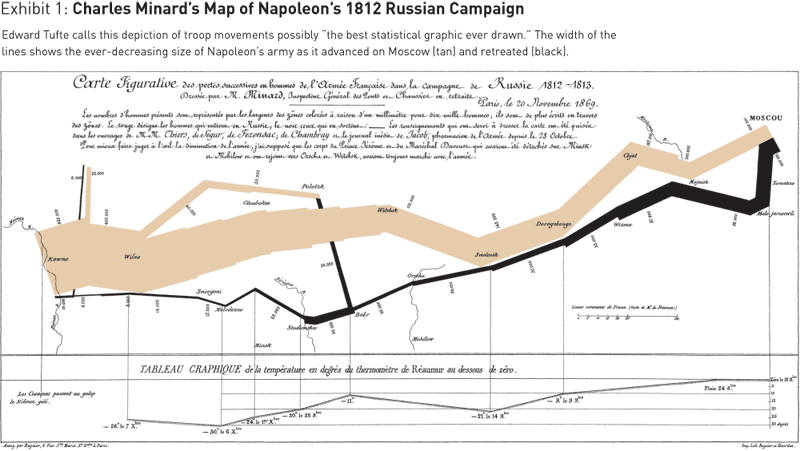
The centerpiece of Tufte’s books is his reverential deconstruction of a map by famed illustrator Charles Minard that depicts the movement and dissipation of troops in Napoleon’s Russian Campaign of 1812 (“It may well be the best statistical graphic ever drawn,” says Tufte). This map, which appears in his first book and is the subject of an entire chapter in his fourth book, is indeed a masterpiece. (See Exhibit 1.) Tufte passionately explains how Minard compiled the best data and incorporated numerous graphic techniques, each one precisely chosen, to convey a compelling and complex message with clarity and elegance.
Unfortunately, Tufte’s books occasionally contradict his own argument that visual presentations of data should be clear, precise, and efficient — for at times he seems to favor aesthetic beauty over functional design. Tufte writes that he designed the books himself so as to make them “self-exemplifying.” He brings an obsessive intensity to his lush, creamy self-published books, which are the ne plus ultra in business/nerd coffee-table tomes. Indeed, they tend to evoke the same drooling awe from geeks and designers that doughnuts inspire in Homer Simpson.
Alas, the writing can only be described as prose that a designer would love. When parsing a medical chart, Tufte writes, “These reports fall under the influence of diagnostic fashions prevailing among doctors and coroners in particular places and times, a troublesome adulterant of the evidence purporting to describe the already sometimes ambiguous matter of the exact bodily site of the primary cancer.” Communications guru, heal thyself!
Moreover, Tufte’s fabricated language for insiders (his shorthand includes words and phrases like chartjunk and avoiding flatland) and crowd-pleasing repetition of his favorite tropes can all too easily repel the managers who would benefit from his ideas.
Wisdom from Comics
What would it take for leading visual teachers to make their craft more useful to managers? A huge step forward would be to marry substance with style — to package a theory about visual language in a book that is equal parts show and tell. That’s why Scott McCloud’s Understanding Comics: The Invisible Art merits inclusion in this review. Please, dear reader, do not discount this book as a juvenile guide to comic books. McCloud’s brilliant work — a comic book that limns comics — is really about learning to see, read, and fully realize the dynamics of words coupled with pictures.
Like Tufte, McCloud has formed a loyal community of fans with his tremendously popular book. Although McCloud’s appeal in the early days may have been limited to comic book collectors and wannabe graphic novelists, today, business thinkers recognize that Understanding Comics is a concise and perfectly realized resource for helping individuals put words and images together meaningfully.
“It’s considered normal in this society for children to combine words and pictures, so long as they grow out of it,” McCloud notes. A book called Understanding Comics may not seem to have a great deal of direct “payoff” for managers. Yet anyone open to the idea of visual management should read this book for the simple benefit of being forced to reexamine his beliefs and habits regarding communication in general.
McCloud explores many of the technical aspects of visual storytelling. He shows how, for example, a visual sequence that jumps from one perspective to another invites the reader to fill in meaning; he takes us on a tour of how literally (or not) artists can represent their subjects. This loving analysis of the craft enables McCloud to accomplish his chief goal: to show how visual storytelling can create meaning in ways no other storytelling method can and thus evoke a powerful response from the reader.
McCloud, an accomplished graphic artist, ingeniously uses the medium to explain the medium. He marries form and content, and the resulting integrity of his book makes it a great foundational read and a lexicon for visual language.
McCloud isn’t the only thought leader to integrate ideas and images. For a terrific daily exercise in how to share complex ideas with simple sketches, visit the blog Indexed. This ingenious exercise in visual alchemy should inspire any manager who immediately turns to decks to present his or her ideas. Blogger Jessica Hagy, whose recent book, Indexed, pulls together the best information graphics from her site, uses simple graphs, Venn diagrams, and other forms of visual shorthand to make a rich point through clever combinations of words and graphics. Instructive by example.
Revenge of the Right-brained
Many successful executives have based their performance on a linear mind-set. They are driven by numbers, they communicate (and direct) through written memos, and they work hard to focus on attaining stated goals. In a hierarchical, relatively structured, command-and-control organization, this approach pays off.
But today’s changing ways of managing call for something different — an approach that relies more on skills tied to visual management. A nice way of framing this approach can be found in Daniel H. Pink’s A Whole New Mind: Why Right-Brainers Will Rule the Future. Pink argues that the global outsourcing of jobs, the automation of work that once provided a healthy wage, and the sheer abundance of our current time have eroded the value of positions based on a logical, single-minded approach. To thrive in the new economy, individuals and managers must think with both the left and right sides of the brain, Pink says. “We are moving from an economy and a society built on the logical, linear, computer-like capabilities of the Information Age to an economy and a society built on the inventive, empathic, big-picture capabilities of what’s rising in its place, the Conceptual Age,” he writes.
This shift requires people to develop a whole-brain approach to work that is artistic, holistic, empathetic, and sensory. Understanding visual language and its role in stories plays an increasingly important part in this new form of thinking, Pink writes, because making meaning is the key to making money. And the key to doing so lies in being able to see work from a broad and holistic perspective: “Seeing the big picture is fast becoming a killer app in business,” Pink says. Indeed, that’s why he wrote the first business book presented in the Japanese comic format of Manga. Johnny Bunko, the hero of his new illustrated career guide, The Adventures of Johnny Bunko: The Last Career Guide You’ll Ever Need, learns six insights about work through his encounter with an animated career guide.
Seeing with the mind’s eye is but one way for managers to make meaning. Honing one’s vision can also start with developing a keen eye for how things get done and how they can be improved. This approach is embodied in the Toyota production system, codified and known as lean management. In this system, based on the principles of eliminating waste and engaging employees by aligning all actions with the understanding of how one’s work creates customer value, visual tools have enormous leverage. Individuals use visuals to communicate key facts about the workplace, and leaders use them to ensure that everyone sees how they fit into the overall work system.
One of the most widely adopted applications is value-stream maps. In 1998 the Lean Enterprise Institute first published a modest workbook titled Learning to See. This resource was designed on a simple premise: that Toyota built part of its success through the organizational practice of mapping the streams through which information and materials travel from first steps to customer value. The authors, lean expert Mike Rother and Toyota veteran John Shook, knew from experience that people could monitor the flow of goods and the health of processes by creating maps comparing the ideal state with current practices. By analyzing the gap between these two conditions, individuals working together could greatly improve the processes, and see where and how their work fit with others.
“Whenever there is a product for a customer, there is a value stream. The challenge lies in seeing it,” write Rother and Shook. They argue that the real intent of the workbook is to enable managers to create flow — the seamless current of products through the organization to the customer (which was, incidentally, the ideal of the early Ford production system). Visual maps of a production system provide a way of realizing this state, helping people identify where — and then why — work is being delayed, inventory is backing up, and errors are being created. Asking people to participate in creating these maps pushes them to assess where, and how, they participate in a sequence of events that results in a product valued by a customer.
Managers have responded to this simple idea. This workbook has sold more than 250,000 copies and been translated into 11 languages. It provides clear, powerful, and simple ways for managers to use this technique to see sources of waste, and to improve the process of production for the customer.
Yet there is a bigger opportunity: learning to see in the workplace is a form of fostering shared meaning. This message comes through in the recent book The Elegant Solution: Toyota’s Formula for Mastering Innovation, in which author Matthew E. May identifies powerful ways that managers benefit by learning to see. First, he shares a basic principle of the Toyota system, which is to begin all problem solving by intensely observing the work itself. Going to the workplace and doing nothing but observing, carefully and patiently, reveals facts to the manager, who can then address the scientific reality of work without being affected by politics or altered by agendas. Learning to go and see the work itself (regardless of the setting) enables individuals to propose actions that directly address the problems that are revealed. On a deeper level, May shows how lean managers “think in pictures” by sharing their findings in a clean, visual, and commonly understood format that prompts everyone to understand and act on the problem together.
Visual Tools
Interestingly, one of the best resources on visual management is possibly one of the least known. Gwendolyn D. Galsworth’s Visual Workplace, Visual Thinking: Creating Enterprise Excellence through the Technologies of the Visual Workplace is a self-published book whose success is built on a community of practitioners.
Galsworth’s guide shows how visual tools support a more powerful, effective, and aware workplace. All work can be broken down into the technical standards of what one works on and the procedural standards of how one integrates this work into a value stream, Galsworth explains. Employees can — and should — capture and communicate this second set of actions.
Her book succeeds by illustrating precisely what she means by “a visual workplace.” Through photos and case studies, Galsworth shares simple visual techniques, such as clearly labeling where parts go on a factory workstation, charting key group metrics on a visible board, or marking the best route for products or workflow through simple visible paths.
A visual workplace is distinguished by cues that indicate when materials are running low or by understandable categories for commonly used materials. It displays times for pickups and dropoffs, boards with critical metrics for project success. These devices guide work and transform culture by uncovering and sharing critical information that would otherwise be hoarded by managers, protected by workers, and simply lost in the grind of getting the next project out the door. As individuals find visual ways to share their standards of getting things done, “the workplace speaks, able at last to tell us where things are, what needs to be done, by when (or for how long), by whom (or by which machine or tool), in what quantity, and how,” she writes. And this principle applies as much to white-collar office work as it does to manufacturing.
Regardless of the setting, says Galsworth, visual tools become the shared language of work. “The visual workplace is about making the truth hold still long enough for us to see it, assess it, make a sound decision, and then take timely action,” she argues. Again, these are not abstract ideals, but operational practices; she speaks of specific tools such as visual displays, production boards, and other commonly understood cues for shared action.
And although Galsworth’s aspirations for the visual workplace may be lofty, they can ultimately apply to any useful approach in this field: “In its fullness, an implementation of the visual workplace will change everything. Everything. In its fullness, it represents the creation of an entirely new set of competencies for people, process, and leadership.
“To tell by looking. To tell everything by looking. To put an end to motion by liberating information that has long been imprisoned in the binders, reports, books, computer files, and data systems of the company — and in the hearts and minds of the workforce — and in the process to liberate the human will.” ![]()
Reprint No. 08310
Tom Ehrenfeld is a freelance writer based in Cambridge, Mass. Formerly a writer and editor with Harvard Business Review and Inc. magazine, he is the author of The Startup Garden: How Growing a Business Grows You (McGraw-Hill, 2001).