What Good User Experience Looks Like
Some examples, past and present, of how good design overcomes complexity. See also “Your Employees’ User Experience Should Be a Strategic Priority.”
These examples, drawn from historical research and from our work at the Bentley University User Experience Center, show how user experience overcomes complexity. They are from customer-facing systems, but they are applicable to the internal systems as well. Indeed, bringing employee systems up to par with the systems facing consumers should be seen as a priority for engaging and retaining talent. See also “Your Employees’ User Experience Should Be a Strategic Priority.”
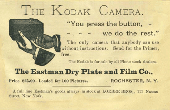
Brownie, the Original One-Button Camera
Introduced in 1900, the first modern handheld communications device was this camera, with only one button needed to capture an image on film.
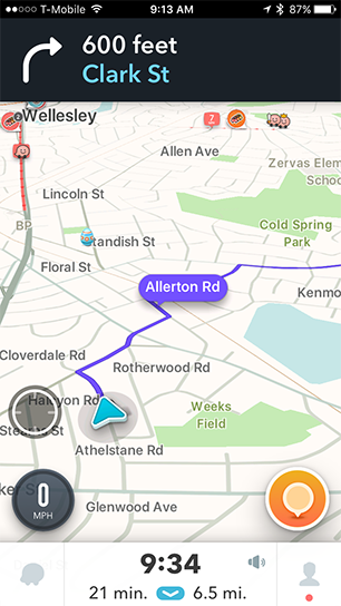
Waze (on a Phone while Driving)
The Waze navigation interface, for all the complexity of its terrain, makes it easy to spot where you are now (the blue arrow), where you’re going (the purple line), and what you’ll find along the way.
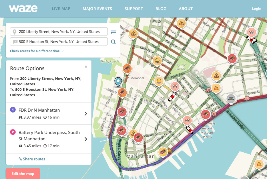
Waze (on a Tablet or Personal Computer)
If you have more time and space, Waze can show more detail. But it uses the same icons (such as the checkered flag for your destination) on every device. It features the most likely choice (Route Options) in large type at the left, with other options smaller, but visible and graphically inviting.
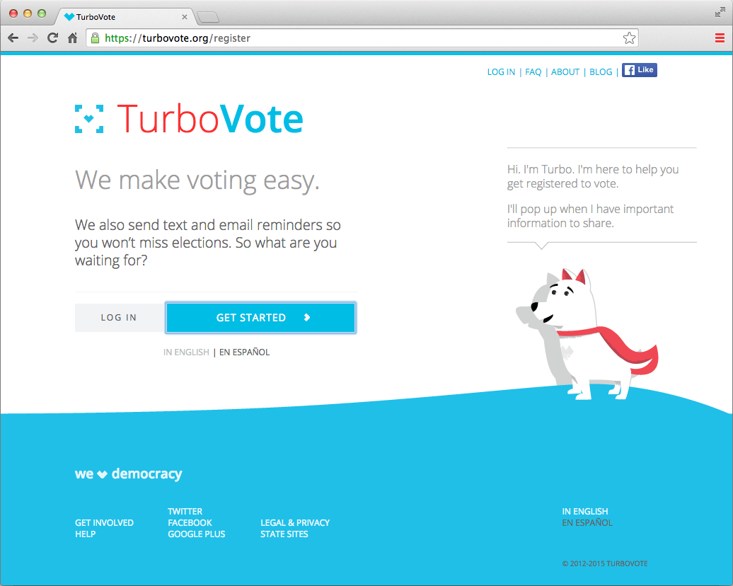
TurboVote Website
This voter registration and reminder site created by Democracy Works was instigated by a graduate student in public policy who kept missing elections. It puts the most-needed essentials at the center, including a call to action (“So what are you waiting for?” and a prominent “Get started” button). Lower-priority options and information are placed around the periphery.
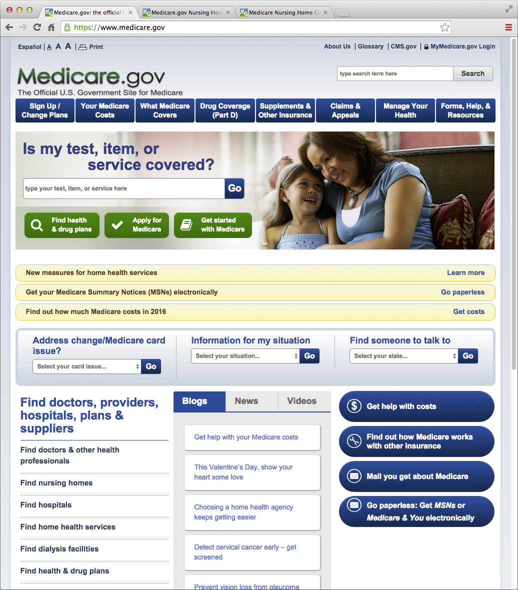
Medicare Home Page
The U.S. Medicare system home page has been iterated upon and improved over the years through in-depth research into the needs of users, many of whom are aging or highly stressed. The home page simplifies their search by grouping similar options through visual cues — green for those starting out, yellow for data, and blue for particular types of help. The system responds to clicks quickly, which reassures visitors.
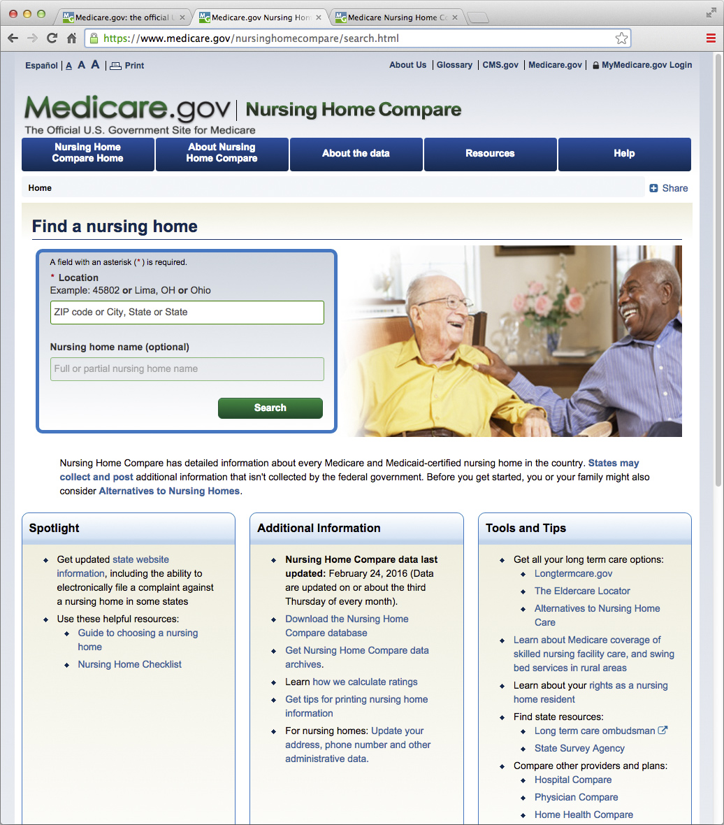
Medicare Nursing Home Search Page
The images of happy people benefiting from the services described here provide an emotional boost, and direct the visitor’s gaze left to the most critical element for a nursing home search: location.
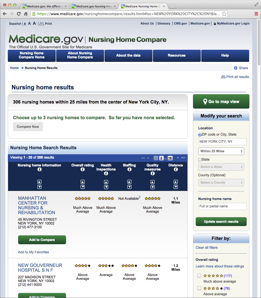
Medicare Nursing Home Comparison Screen
The Medicare website has a five-star rating system that, like the ratings in Consumer Reports, makes it easy to compare options.

