Why Pictures Are Worth a Thousand Words
Illustrations aren't just ornaments for smart articles. They convey meaning.
As s+b marks 20 years of publication, we are looking back (and forward) to reflect on the themes, people, and ideas that have animated two decades of original thinking. This is the fourth in a series of blog posts.
There is a case to be made that good illustration is good business magazine content. And strategy+business is the case study.
Take, for example, the illustration, by Richard Mia, for “The Social Life of Brands” in the Autumn 2012 issue. It contains a multilayered commentary that suggests through symbolism that brands are not simply packages and labels but integrated communications between public and industry. The art — a depiction of a blossoming flower whose buildings blocks are the text bubbles that populate a smart phone screen — helps announce the story without explicitly spelling out its thesis. There are no icons of McDonald’s golden arches or pictures of brains.
This approach has been evident from the magazine’s founding in 1995. But in recent years, such striking full-page illustrations have become a vital part of the reader’s experience. As such, they tap into a trend toward conceptual illustration that has been building for several decades
Frontal nudity notwithstanding, I had only two ironclad taboos when I began my job as art director of the New York Times op-ed page in 1973: Illustrations could not under any circumstances include either Uncle Sam or dollar signs because they were the most frequently and unimaginatively used of all the cliches. Still, editorial illustrations, especially for niche business magazine content, rely on our familiarity of these and other common tropes that comprise a shared visual language. Illustrating an article on banks without showing a representation of a bank building or teller window, or a businessperson without a suit and briefcase is nigh impossible. So, removing Uncle Sam and dollar signs from the artists’ toolkit demanded agile thinking and novel symbols.
Thankfully, in the mid-1960s a new editorial art form, known as conceptual illustration, was developed to illustrate difficult concepts and trigger audience interaction through metaphor and symbolism. Over time this conceptual method dominated magazines and newspapers whose readers eventually learned how to decipher the coded messages.
More than drawings, paintings, or collages that mimic text, conceptual illustrations are brainteasers that engage multiple senses. Faced with various pictorial clues, the reader’s discovery also serves as the enticement into an article in the same way that a compelling pull quote captures a reader’s attention. Yet a smart conceptual illustration has the potential to stimulate even more than a choice quotation. Strategy+business prides itself on developing high-impact thought leadership. Through its art direction, which orchestrates the use of images and graphic material in ways that will surprise readers, it consistently deploys illustrations — and not just text — that help lead readers to thought.
In concert with a provocative headline, subhead, and pull quotes, images and illustration can effectively coax the reader into the story. Conceptual illustrations do what words cannot. They reject realism for surrealism, literalism for metaphor, and invite interpretation. Illustrations are veritable Rorschach tests with multiple meanings. Some contain optical illusions and witty ideas. Some are strikingly designed yet simply rendered. Some are perfectly apt for one story but general enough to also be illustrative of others. Often, you have to look at them two or three times before really getting them. Strategy+business’s images make the often daunting task of reading complex data just a tad more enjoyable — not just as diversions but by enhancing the cognitive experience.
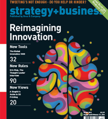
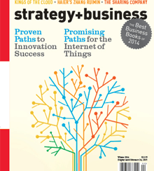
A good example is the psychedelic blotch on the cover of the Winter 2013 issue devoted to “Reimagining Innovation.” The blotch — or splatter — is actually a multicolored brain-like shape that avoided any reference to a literal brain. The art, by Craig & Karl, was in fact, the perfect evocation of the theme, a rethinking of the place from which innovation comes. And it suggests the idea that the brain figuratively lights up when creativity is occurring. The cover image on the Winter 2014 issue, about paths to innovation and the Internet of Things, is similarly engaging. The artwork, by Harry Campbell, features an image of a branching tree made from intersecting colored schematic lines, which symbolically suggesting the brain’s neural pathways. The point is made without using brain tissue.
Conceptual illustration as practiced by s+b cuts two ways. Too many illustrations of neuron circuits can become redundant — a new idea can easily become old with use. That’s why the orchestration of style is essential, and s+b does it well. In the same Winter 2014 issue neurons are offset by gears in Lincoln Agnew’s illustration for “A Strategist’s Guide to the Internet of Things.” It is a collage in a midcentury modern style that expresses the idea of interconnectivity and business opportunity while avoiding any of the literal mental pictures that those words conjure. A startling illustration in the Summer 2015 issue, by Martin Leon Barreto, for “The $112 Billion CEO Succession Problem,” about the costly prospect of poor planning for leadership transitions, shows construction workers building a human facade out of red brick. The style is lighthearted while the message of an immovable obstruction is poignant. A photograph of the ousted CEOs would hardly be as engaging and memorable.
By applying the same rigor and imagination to conceptual illustrations as it does to concrete writing, strategy+business says to its readers that it respects their intelligence and rewards them with the gift of art. I wouldn’t be surprised if those readers, in turn, look forward as much to the artwork as the articles.


